Tuesday, August 31, 2010

Green Pears Color Study


Here is this morning's green pear study.  I put the pears on the patio in full sun. What a difference. I  made up the background. Was about to overwork the piece and stopped myself. Oh and dropped the painting into my open palette. I was covered with paint after that and cleaned myself up with good, old olive oil. There is a tip for you messy painters. 

Monday, August 30, 2010

Stage 3 and head to Stage 4 - My head hurts


Here is the almost complete glass study.  The focal point on this study is where the yellow bottle and the green bottle meet.  This rest of the bottles, I can take them to stage 2 and 3.  I just learned that today.  I will take the yellow and green bottle to stage 4.  I also was too mechnical with this piece.  I was told to walk away and relax a bit before I continued on the orange glass. I was making it too dark. The piece was drying too quickly and I had to re-wet it several times. This increased my frustration. I was told to look at other completed glass paintings that Susan did in the studio. I wasn't getting my stroke painterly.  I was too rigid.  So, I was pretty happy when the class was over and were alot people working independently on their pieces. Each one of us were working on different subject. At last, one artist cried out "This is hard".  We all laughed.  Learning color is hard... but, boy, is it worth it.

Remember, dull the colors. Cool the warms and warm the cools. Dull the colors, dull those colors.  


Glass Study - stage 2 complete


Okay - so this is the stage 2 glass study that I will continue working on today.  


Saturday, August 28, 2010

Daily Color Study - Green Pear


This was my color study today - a green pear. Green is a difficult color and especially, when it is a pear. The pear is made up of a pyramid shape on top and spherical shape on the bottom. The pear has "shoulders".   I liked my shadow but realized after I got frustrated and started to rush, that I was not logically thinking about the color. I put the piece in the freezer so it won't dry and I will work on it in the morning. 
Looking at it after putting it away, I saw where I needed to dull the color in the light with more orange and magenta. I had made it too green. The shadow side needed more blue.

Friday, August 27, 2010

Daily Color Study - Orange


Here is a daily color study. Learning color is very difficult. I have said it before, that I think watercolors are easier to paint with than oil. The majority of the studies I have posted this year have been great lessons but horrible paintings. Yikes. I like to go back and review my progress. I am getting there soooo slowly. It it hard... but I know the end results will be worth it!

Thursday, August 26, 2010

Empty Bottles

More of the empty bottles. I continued working on the color study of bottles. Oh - my head hurts.
I will post a picture later. I need to sit and take in all that I learned.
I had a discussion today about what makes a sweet color. A sweet color is pure color. Very few colors are pure color. Lemons and oranges are but you can cool them down with a cool-warm color. For example, pink on orange.

More color studies

I painted an orange with a small mason jar. Ran into problems with the mason jar. They, too, are on the deck drying. The opaque orange has a darker shadow closer to the object. The orange. And the mason jar was just overwhelming.
I am heading to class to learn more. Aye.

Tuesday, August 24, 2010

Picking Peppers

I picked a green pepper to do a color study today as part my search to improve my paintings.
That sucker was the most difficult to paint and then there was the stem. I stopped and called it done. I will try, again, tomorrow.
I will conquer the pepper.
No picture - it is out on the hot deck - roasting in the sun.

Monday, August 23, 2010

Watch out for the Glass


This is study of 5 different glass bottles. The glass in the setup is either translucent or transparent. The shadows are treated differently.
Here is starting of stage 2. This is my favorite stage of the painting because if you don't get it right at this stage, your painting will fail.

Thursday, August 19, 2010

Check out my jug and pear - no it is not a metaphor


Here is the completed study of a terracotta jug with a greenish, yellowish, orangey pear. I learned a lot doing this piece of work in handling color. The jug is overworked but the pear is spontaneous.
What I also noticed was I have dark side when oil painting. I was given a very acceptable suggestion regarding darkening the shadow under the jug. I painted a dark line around the bottom. Why? I don't like being told what to do and I proceeded to show it by painting a very dark line around the bottom of the jug. As if to say "Is it dark enough for you now?"
I took it to an extreme which was a silly response.
When I was corrected, again, and told I knew how to fix so do it, I caught myself. I had to fix the damage that I did to the painting. I fixed it and started laughing. I knew I did this when I didn't like my class assignment or work assignment changed especially when I thought the work was good. Why? I was done and thought it was good enough.
I responded the same way to the oil painting. This time, though, I worked to make it better rather than exaggerating the suggestion to show them how bad it could really look.
Good lesson.

Here are the steps to a jug and pear


Here are the steps to painting a jug and pear.

Tuesday, August 10, 2010

Too Hot on the Patio


I was doing a study on the patio and it was too hot. I hurried through this piece and itis obvious. Not very good but I enjoyed the time... despite the heat.
The planter should have been dulled down more. It wasn't the bright. I left the glass table top unfinished. The plants were nice and messy. I like that style. The fence and the planters are too close in color.

Monday, August 9, 2010

Jug and Pear Study - continued


I am still working on the jug and pear study. I didn't have time to finish the pear but check out the color in the jug. Wow. I was told the colors are very similar to a Caucasian's face.
I learned to trust what I see and how to improve my shadows. Also, to check your drawing by turning your back to the painting and viewing it with a mirror to correct the drawing. It works great.

Thursday, August 5, 2010

Study of a Terra Cotta Jug and Pear


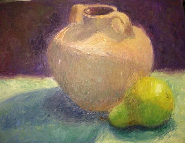
This is an incomplete study of a terra cotta jug and pear. Stage one and two are complete. In stage one, the warm side of the jug, I painted orange, the green table cloth in the the light is painted a warm yellow with lots of white, the top of the pear is pure yellow. The background is cool and I started with purple. The shaded jug I painted mauve and the cast shadow, blue. I then painted the shades part of the pear a warm green and the cast shadow blue.
In the second stage, I had to darken the warm orange jug because I painted it too light. The top of the pear I cooled with a warm green. The table cloth was cooled with veridian green with lots of white. The background I dulled it with with orange, rose and then blue.
The shaded jug was dulled with orange and green. The cast shadows had more yellow and green. The shaded pear had more yellowish orange.
Once all the values and colors were correct, I moved to stage three, with bands of light. I started with the background, the table cloth and the shadows. Since the jug is the focal point, I will put the bands on it last.

Comparing lemons to lemons


I can see the difference between the two lemon studies. They were done a few days apart and I see where I learned more. Notice how the lemon next to the bottle looks more spontaneous. That is because it is more spontaneous and not overworked. To me, it was more difficult to paint the spontaneous lemon because I had to remind myself to STOP during each of the four stages. The other lemon has more color shifts but the colors are not as beautiful as the other lemon's color despite the colors in the over worked lemon.
Both lemons still need the lines broken up to make them look more realistic.

Start to Finish


This was my first study in the Color Intensity Class. It was a start. I find I want to over think this painting process. Then, I overwork the piece and ruin the under painting that I spent so much time making.
The lines in the lemon should be less noticeable. More paint should be applied at the first and second stage. I need to use less of the palette knife tip. Dulling the color more in the shade would improve the painting. I need to remember the top shadow on the lemon is darker. Trust what I see is important. I am not concerned about the composition because this is a study. My focus is on seeing the light, practicing the stages, seeing the difference between light and dark, warm and cool, dull and bright. Each color has to be compared to the color next to it. No talking is allowed while you paint because are looking to see the color. Their are bands of color throughout the painting. It is difficult if you do not concentrate BUT you cannot stare into the object. Else, you will only see local color. It is constant scanning with your eyes.

This an 8x10 gessoboard oil painting. I will mix white acrylic and gesso to paint the back sides of these studies so I can reuse them.

Wednesday, August 4, 2010

So much color and light, so little time


Here is another oil study I did today in class. I am including the one from yesterday with a close up of the flower. The studies are painting the light. Determining what is cool or warm and dull or bright. You do not paint a flower, a vase, an apple. You paint the light. With Susan Sarback's method and teaching, you will learn quickly to see and paint. I just want to learn to be a better oil painter.
I start my weekly studies tomorrow. This will continue twice a week until I am ready to go on.
This might take a few years but I will do it! I am told,I see color great. No problem. But, I need learn NOT to use the palette knife tip when I am putting down paint. Also,work on drawing the shapes as cylinders and such by drawing through them. Put down geometric planes rather than I drawing what I see. I learned from the best how to draw what I see. Now, I need to draw through the objects. I use to do that in Mathematics so I think I won't have a problem. It just feels odd.

Tuesday, August 3, 2010

Jumping to Stage 4


I finished this study today, stage 4, in Susan Sarback's class, Color Intensity. I can see the color but I have a difficult time painting it. I will keep working on the process the next 12 weeks in her classroom.

Monday, August 2, 2010

Stage 1


Here is the stage 1 painting to the Color Intensive class I am taking with Susan Sarback. The still life setup is on the left side of this picture. I like this stage because it is the easiest. Basically, is it an abstract value study using only pure colors that are warm for light, cool for shadows. Sounds pretty easy,

Sunday, August 1, 2010

Is it August Already?

I just started my color intensity classes with Susan Sarback and I am in my right mind so I can paint. So, keeping up with my posts haven't popped into my head until today. I think the left side of my brain decided it needed a turn. In the class, we are doing color studies and watching slide shows and demonstrations.
In addition, my husband bought this wonderful painting by Susan of the bike trail. It is beautiful. He is very pleased since he has biked this particular trail for years.